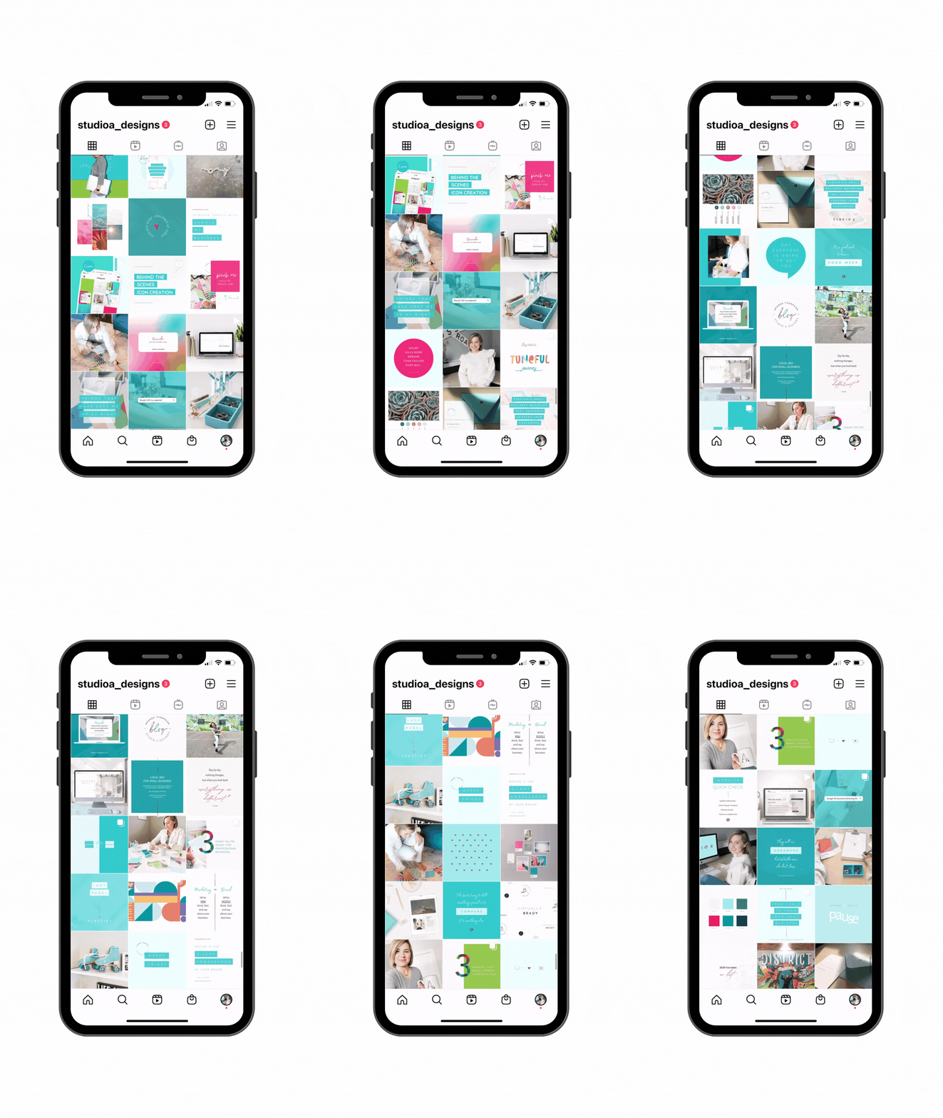
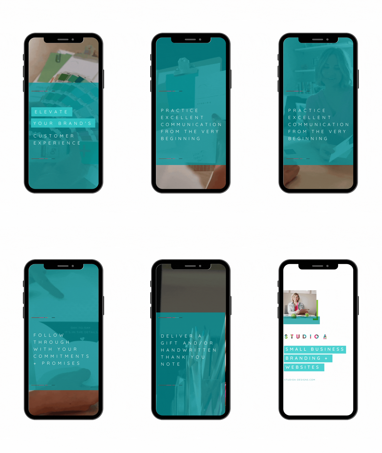
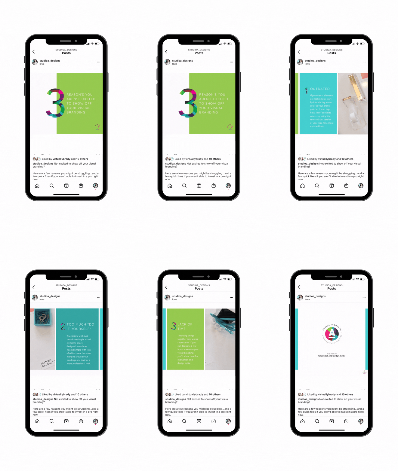
So you’re looking for ways to elevate your brand on social media. It can be tough to make your brand unique, but by implementing a few of these tactics, you can definitely level up the visual look of your brand. Small businesses use social media every day to drive brand awareness. The most effective businesses have learned the importance of strong, cohesive visuals to help their audience process information quickly. Research shows that people tend to remember 10% of what they hear and 20% of what they read. However, they tend to remember 80% of what they SEE. When you have only a few seconds as your potential customer is scrolling their social feed, striking visuals can make a greater impression with your message.
VISUAL BRANDING, EXPLAINED
Visual branding on social media, simply put, is the aesthetic look to your social media's overall presence.
- Cognitively, a strong visual brand helps your message stick with your potential customer with greater comprehension and recollection.
- Emotionally, visuals can stimulate attitudes that influence decision-making. Visuals help a brand get to the point fast and simply. Visuals can support your brand's story. If you can think of your brand as an emotional experience you can help your audience understand and resonate with you.
How to Elevate Your Visual Brand on Social Media
01. A mix of graphical & imagery elements
Data visualization, infographics, memes and GIFs, inspirational quotes, videos and more can not only increase engagement but pack a punch visually.
Pro tips for post layouts:
- Keep it simple - Include one phrase or grouping of data per slide. Packing too much into a single graphic is overwhelming and makes it hard for the viewer to process. For example, when sharing on Instagram, use carousels for static graphics or reels and stories when incorporating video. Check out a few of the graphics I like to use on my social media. If you can create some B footage video and photos to have on hand for posting you'll save yourself some time when you get ready to put together your content!
- Don't be afraid of white space - Less is more. Keep big margins, reduce text and logo size to increase professionalism and aesthetic quality.
- Plan ahead for your grid - I like to keep the overall look of my Instagram profile in mind so that multiple posts look nice side by side on my grid. If you're post asks for a video thumbnail make sure you design one that fits with your aesthetic.
- Include your logo in your visual designs. It doesn't have to be front and center, but if you can aim to include it as part of your post you'll improve brand recognition.
Less is more.
Maybe you're thinking, "But Amanda, I'm not a designer! I don't know what I'm doing!" Listen, friend, you don't have to be a designer to create visually appealing social media content. You can use the online tools that other pro designers use for their social media posts. I love using CANVA. Canva's pro subscription makes it even easier with the ability to instantly resize graphics, optimized for various social platforms. Take a single graphic and duplicate it for Instagram, Facebook, Linkedin, stories, pins, tweets and more. Canva also saves your uploaded brand assets in one place to reuse and repurpose.
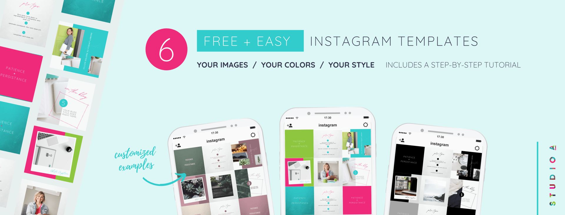
Check out my Free Canva templates for some examples of graphical and photographical elements. You can edit the templates with your brand's images, colors and fonts.
02. Font pairings that fit your brand's story
To strengthen your visual story stay consistent with the same set of fonts. If you haven't established your brand's fonts yet, I recommend using one or two fonts throughout all of your brand materials. Purchase proper licenses for the way you'll be using the fonts. When using them for your small business, you'll want to purchase a commercial license. CREATIVE MARKET and ENVATO ELEMENTS are a couple of my favorite websites on which to purchase typefaces.
Fonts are available for free commercial use from GOOGLE, FONT BUNDLES, or within CANVA.
Pro tips for pairing fonts that work well together:
- Pair different weights of the same typeface. If the idea of pairing fonts overwhelms you, find ONE typeface with several options for weights. Choose a heavier one to use as a heading and use a light or book version in your body copy them consistently throughout your graphics.
- Use one serif and one sans serif typeface.
A serif is simply a hook or a small line attached to a letter. Having one of each adds visual interest. Try using a serif headline and sans serif (serif free) body text, or the opposite and see which conveys your brand better.
- Make it legible but with high contrast. Don't go crazy with hard to read fonts or a couple of fonts that are so crazy different that they compete with each other. Generally, one more ornate or bold font does well as a heading.
- Show some personality. Your brand typefaces should be intentional for the style and message you convey to your audience. Keep in mind the mood of your brand and mimic that with your font choice.
03. Photography with cohesive filter settings
To tell your story well visually, it's important to stay consistent. By imagery I don't just mean photography here, I'm referring to video as well! Facebook posts with images see 2.3 times more engagement than those without images. Creating a brand content library can help you not only keep things visually consistent with the content you post, it will also keep you organized. Some brands like to have a folder in the cloud with brand photos, videos and more. If you have a social media planner like LATER, you can upload them into the library and tag your images and videos.
Creating a content library can help you not only keep things visually consistent, it will also keep you organized.
04. Intentional, consistent color palette
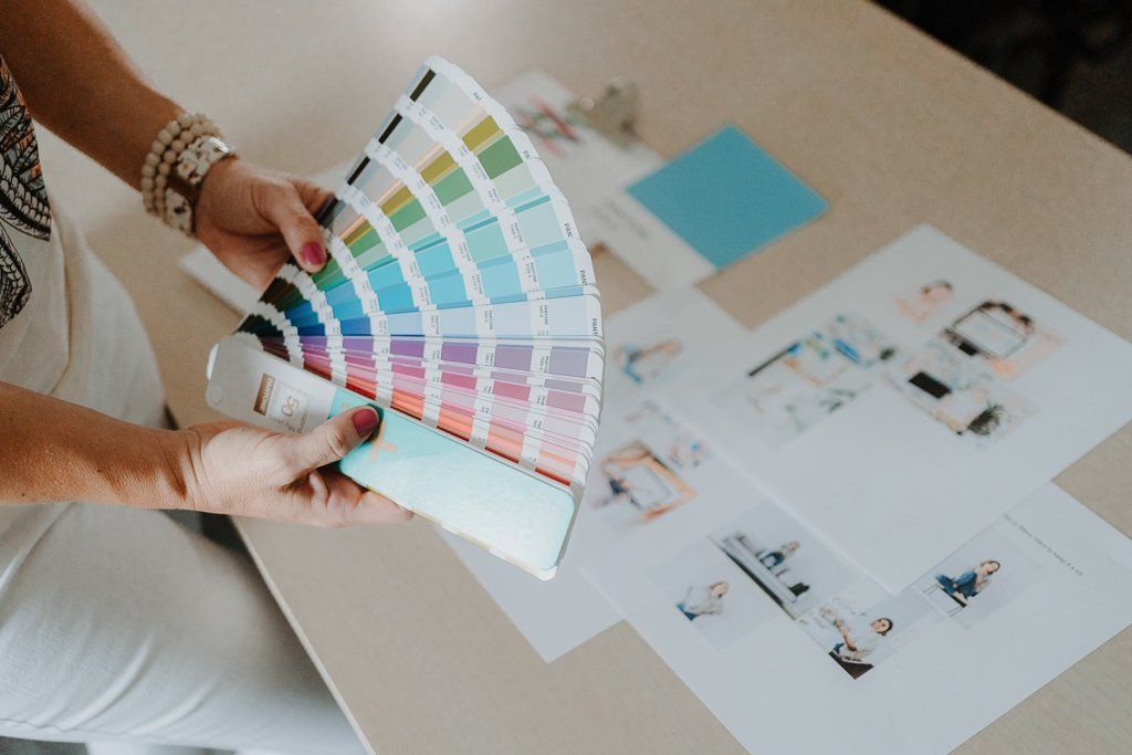
Once you create a palette that is right for you, all branding across all your channels begins to look more cohesive. When people view your website, Instagram, Facebook or any platform you use, they will know it's from your brand. It may seem overwhelming to choose your colors, but just think about what in your life inspires you and your brand. Maybe, like me, you find inspiration in nature, or maybe it's urban landscape or a quilt your grandmother made. Once you find inspiration, translate that into a color palette that is unique to you!
Once you find inspiration, translate that into a color palette that is unique to you!
You may be thinking, "Where do I even start?" Don't fret! There are some great resources for you to use to begin the search on what colors you want. Whether you have some colors in mind or you are starting from complete scratch, these ares some helpful places to look:
- The Adobe Color Wheel is a great, interactive site where you can test how different colors look when you pair them together.
- Pantone
is another place where you can browse hundreds of color options. If you are looking for specific colors, Pantone will have it for you!
05. Put your visual elements together in a mini style guide
Everything can be housed on a one-page quick reference document called a mini style guide to serve you as you continue to elevate your social media visuals. I'd love for you to customize this MINI STYLE GUIDE CANVA TEMPLATE I created. Play around with it and reference back to it as often as you like!
REMEMBER....VISUALS ARE PART OF A THREE INGREDIENT BRAND STRATEGY RECIPE
There are three pieces to a good brand strategy, including the Brand Heart, Brand Messaging and Brand Visuals.
CONTACT ME AND I'll SEND YOU A LINK TO SCHEDULE A FREE COMPLIMENTARY DISCOVERY CALL. LET'S CHAT ABOUT SOME WAYS WE CAN CREATE A BRAND THAT MAKES YOUR SERVICES SHINE!
Sources:
SMALL BUSINESS GENUIS

The A-List is your 60-second inbox scroll for local brand and website tips, savvy small biz resources and the take-aways you need to get through this crazy thing called entrepreneurship.
Join the email community!
Email Community Signup
BLOG TOPICS
BROWSE RECENT POSTS
I get to use creativity everyday to help entrepreneurs focus on their passions to discovering their brand's "sweet spot" in the marketplace...and I absolutely LOVE IT!
I'd love to connect with you to chat more about your business.
