If you're a business owner of any kind, you can probably relate to seeing a lot of new terms and phrases the regular world doesn't use. Each industry basically has it's own language. What is normal to you isn't to everyone else.
It’s sort of how Elle Woods feels comfortable using legal jargon in her everyday life. 💁♀️
Well, that’s how I feel about graphic design terms. And I’m sure it’s how you feel about your own industry, too!
Even though these words are normal to you and you can carry on a conversation using this language, what’s important to remember is that your audience and your clients don’t necessarily know these things and it’s up to you to reduce confusion by educating them so they fully understand what you’re saying.
I’ve been guilty of just assuming people know what I mean when I say,
“here are your HEX codes!” or
“can you send over that vector file?” 😅
So, if you’re among the many business owners that see or hear graphic design terms when working with brand or website designers and you’re always left thinking, “what the heck does that mean?!”, save your Google search - I’ve got you covered, starting with the typography edition. ⬇️
Common Typography Terms & What They Mean
Typeface vs. Font
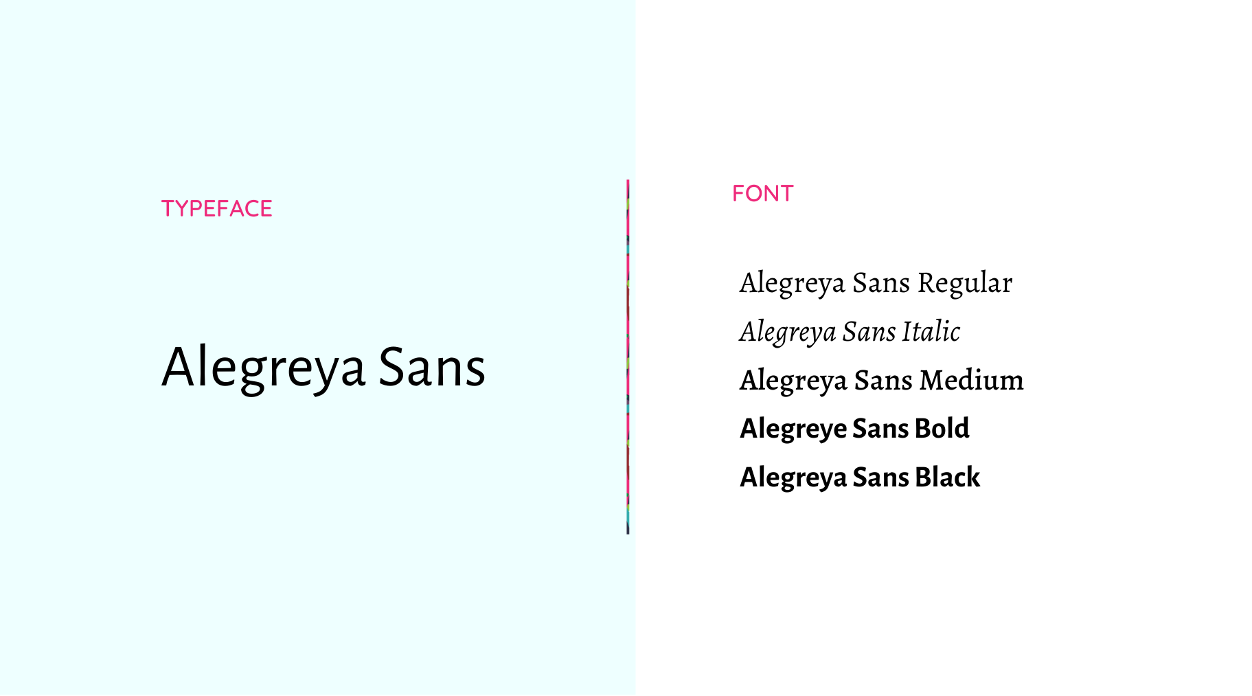
In graphic design, typography is what we refer to as the different styles of text that exist within your brand. Most brands have different fonts and font styles that they use and each of these make up their entire brand typography. While we’re on the topic, you might also be wondering the difference between a typeface and a font. The term typeface is the collective name of a family of related fonts. A font is the variation in weigh and style of a typeface.
Here’s a simple example of one of my own:
Serif vs. Sans Serif
A serif is a decorative stroke that finishes off the end of a letters stem - this is sometimes referred to as the “feet” of the letters. Common fonts that have serifs include: Times New Roman, Garamond and Georgia.
A sans serif typeface, on the other hand, does not include serif strokes.
Common san serif options include: Arial, Helvetica, Proxima or Calibri.

So, which is better: serif or sans serif? It truly comes down to personal preference and which font best suits your brand based on style, mood, and personality but generally speaking, sans serif fonts have slightly increased readability, so this a good option for your body text!
Which leads me to our next term…
Body Copy vs. Headings & Subheadings
In writing of any kind, whether it be a blog post like this, your website or even your social media graphics, there’s usually going to be headings, subheadings and body copy.
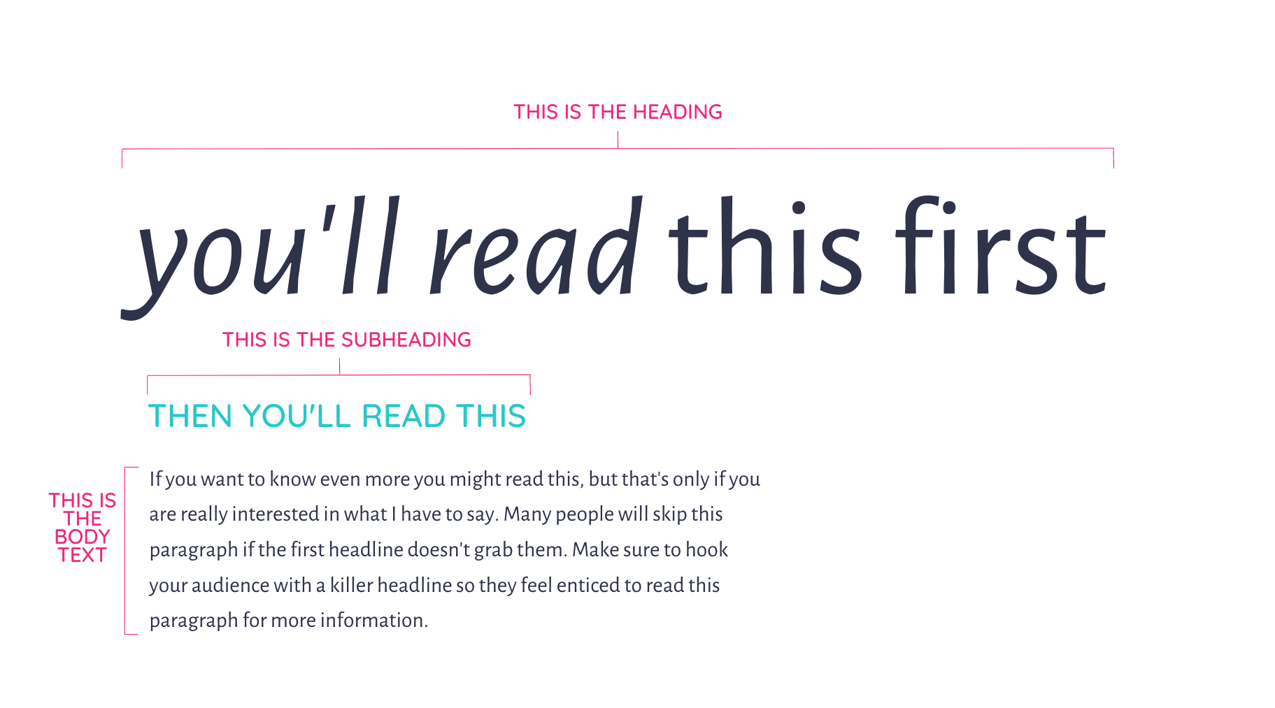
Headings and subheadings are usually pretty obvious - they’re the larger and probably more bolded pieces of text.
Body copy is the primary text in your content and focuses on explaining all of the details for the topic at hand. (pst: you’re reading body copy right now!)
Hierarchy
In graphic design, the hierarchy includes different principles such as, size, color, contrast, alignment, repetition and brightness to emphasize certain aspects of the design. (see above graphic for heirarchy of text)
You want all of these pieces to work together in the correct way in order to create a visual that attracts your audience properly.
If the hierarchy isn’t used correctly, you can draw attention away from something that you really want your viewers to take in. When used correctly, you can make sure your audience sees exactly what you want them to pay attention to.
Kerning, Leading & Tracking
These three terms go hand in hand with the overall typography in your brand.
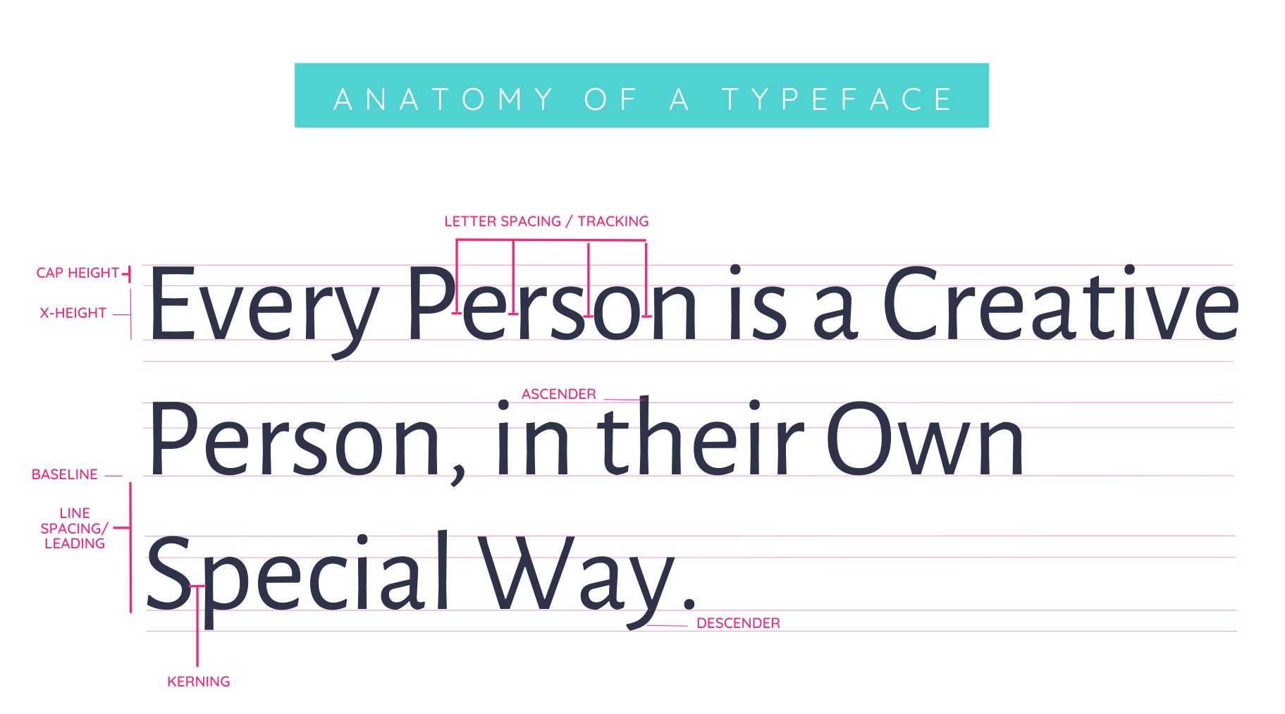
Tracking is the overall spacing between groups of letters of an entire word. Kerning, on the other hand, is the spacing between the individual letters or characters. And leading is the vertical spacing between lines of type.
If you’ve ever written an email, a blog post or even created something in Canva, you’ve likely seen the spot where you can adjust your line height or letter spacing. It often looks like this:
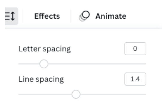
Well, these are the technical design terms for that! These elements make a huge difference in the readability and professionalism of the typography in your designs, so they are super important to pay attention to.
Ascender vs. Descender
In typography, an ascender is an upward stem of a lowercase letter that extends beyond the meanline and x-height of a font. These are sometimes referred to as arches, stems or hooks and the most common letters with ascenders include: b, d, f, h, i, k, l and t.
As you might be able to guess, descenders are the exact opposite. These letters have a stem that falls below the baseline and the most common letters with descenders include: g, j, q, p and y.
Now, I know what you might be thinking…
“meanline? X-height? baseline? WHAT?!”
Before you lose it on me, let me give you a visual that really brings all of this together ⬇️
Lorum Ipsum
Lorem ipsum is placeholder text that contains all letters of the alphabet that graphic designers often use to show you how your typography will visually look with certain fonts.
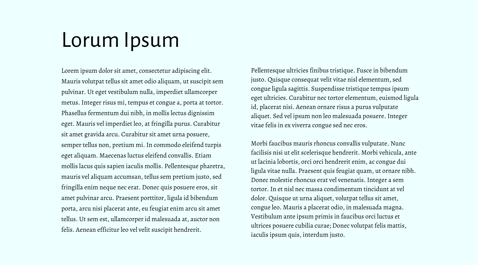
This will often be used in brand guides that are delivered to you when you invest in professional branding! You also may see this on Canva or other graphic design tools when exploring certain templates included in your brand package.
And that’s a wrap on common typography terms!
I’m willing to bet you’ve seen one or more of these terms at least a time or two in your business owner life and up until now, you might not have known what they mean.
Now you do! But don’t worry, I won’t quiz you.
The point of knowing these terms isn’t for you to be an expert in graphic design. It’s simply to help you communicate with and better understand conversations with
your graphic designer so that you can achieve the service that you really need!
The more you know, the more you can strategically relate to your designer, and ultimately your target audience.
Cheers !! 🥂

The A-List is your 60-second inbox scroll for local brand and website tips, savvy small biz resources and the take-aways you need to get through this crazy thing called entrepreneurship.
Join the email community!
Email Community Signup
BLOG TOPICS
BROWSE RECENT POSTS
I get to use creativity everyday to help entrepreneurs focus on their passions to discovering their brand's "sweet spot" in the marketplace...and I absolutely LOVE IT!
I'd love to connect with you to chat more about your business.
