8.25 SECONDS.
That’s how long you have to capture the attention of someone that lands on your website.
Once there, it takes only about 7 seconds for them to form an opinion about you and your business - and you don’t have a second chance at a good first impression.
This is why designers and marketers are so obsessed with content that falls “above the fold.”
If you’re a business owner of any kind, but especially if you're running your business online, you’ve likely heard this term before.
Even though it might sound like design jargon you don’t need to worry about, it’s actually one of the most important things that need your attention if you want to capture more leads and sales (or conversions as we call it).
In fact, addressing this one section on your website, sales page or landing page could totally change the game for the results you see in your business.
And I’m here to help you master it. 👋🏼
Understanding "Above the Fold." What it is. Why it Matters and What to Include.
What does "Above the Fold" mean?
Above the fold is a common term used in design and marketing today, but did you know that this term and the concept have been around since the printing press?!
Newspapers have always been printed on large sheets of paper and folded in half to sit on racks at newsstands. Because of this, it became very clear early on that in order to attract the audience, they had to be strategic with what content could be seen once the papers were folded.
Catchy headlines and images are often displayed on the front page of the paper. This isn't by chance! It’s on purpose and it’s the same way to address your website and landing pages.
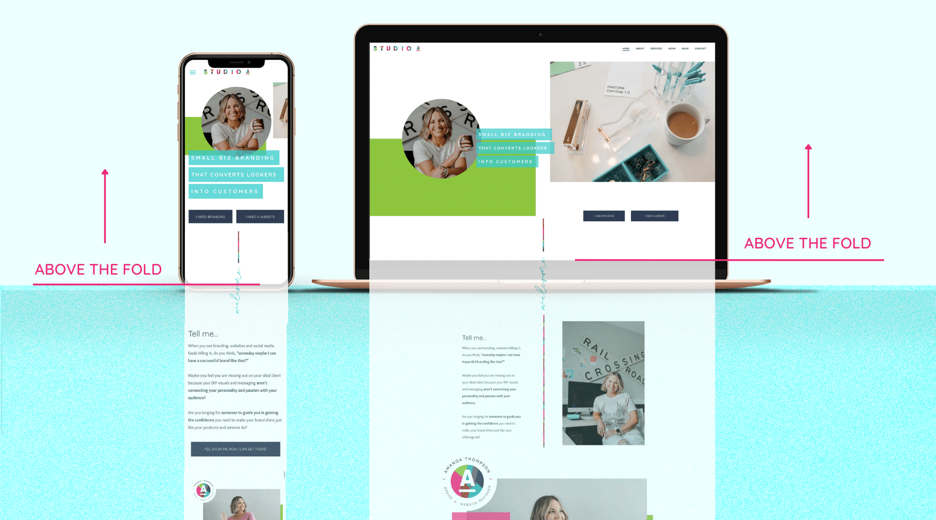
In today’s time, we could translate “above the fold” to “above the scroll” because that’s exactly what it is: the content that is clearly seen before a visitor starts scrolling.
Anything that requires you to scroll further down the page is considered to be below the fold and the fold is essentially the bottom of the screen.
This means that the fold is specifically determined by the type of device a user is on. The fold on a computer will be much different than the fold on a phone screen, which is why optimizing the format of your pages for mobile is SO important!
Here’s an example FROM MY WEBSITE so you can see this in action:
What should you put above the fold?
Now that you know what “above the fold” actually means, you’re probably wondering what content actually needs to go there.
The actual content that goes above the fold will vary based on your goal for each page, but the format is generally the same no matter which page it is!
When creating website pages for myself and for my clients, I stick to this general format for above the fold:
1. A strong hero section with an image and a headline
I know, I know - more designer language. Hero section?! I’ve got you!
A hero section is simply designer talk for the first thing that someone sees when they visit your website.
It’s the section that falls directly below your logo and menu bar and this section should always include a really strong headline.
This section is where the first impression of your brand is made, so if it doesn’t capture the viewer's attention, chances are they’ll exit out of your website. 😩
Since that’s the exact opposite of what I want for you, here’s a few tips for creating an attention-getting headline:
- Make it a clear statement of what you do and who you help
- List the specific service or product you offer so they don’t have to wonder what exactly that is
- Call out who it’s specifically for, because people connect with identities very quickly
You don’t have to include all three of these, but if you can hit on at least two of them, you’ll be on your way to a scroll-stopping headline!
Here’s WHAT THIS LOOKS LIKE in action:

In addition to your headline, try to include an image of yourself if you can. People connect with people so it’s important that they can put a face to the offering they’re seeking.
2. SPEAK TO THE RESULTS OR TRANSFORMATION THEY CAN EXPECT
Did you know that emotion drives 80% of our decision-making?
This means that someone will make a decision much more quickly if you can speak to the emotion or feeling that will come with it.
When someone stumbles upon your website, there’s a high chance it’s because they are experiencing a problem that needs to be solved.
The problem they're facing is likely causing them to feel a certain way, whether that be angry, sad, frustrated, etc. and they want the solution to make them feel the opposite of that.
When you speak to that emotion and show them how it’s possible by including a result or transformation statement, the chance of them taking action, whether that be buying, opting in, following, sharing, etc., will be much greater.
Here’s WHAT THIS CAN LOOK LIKE:
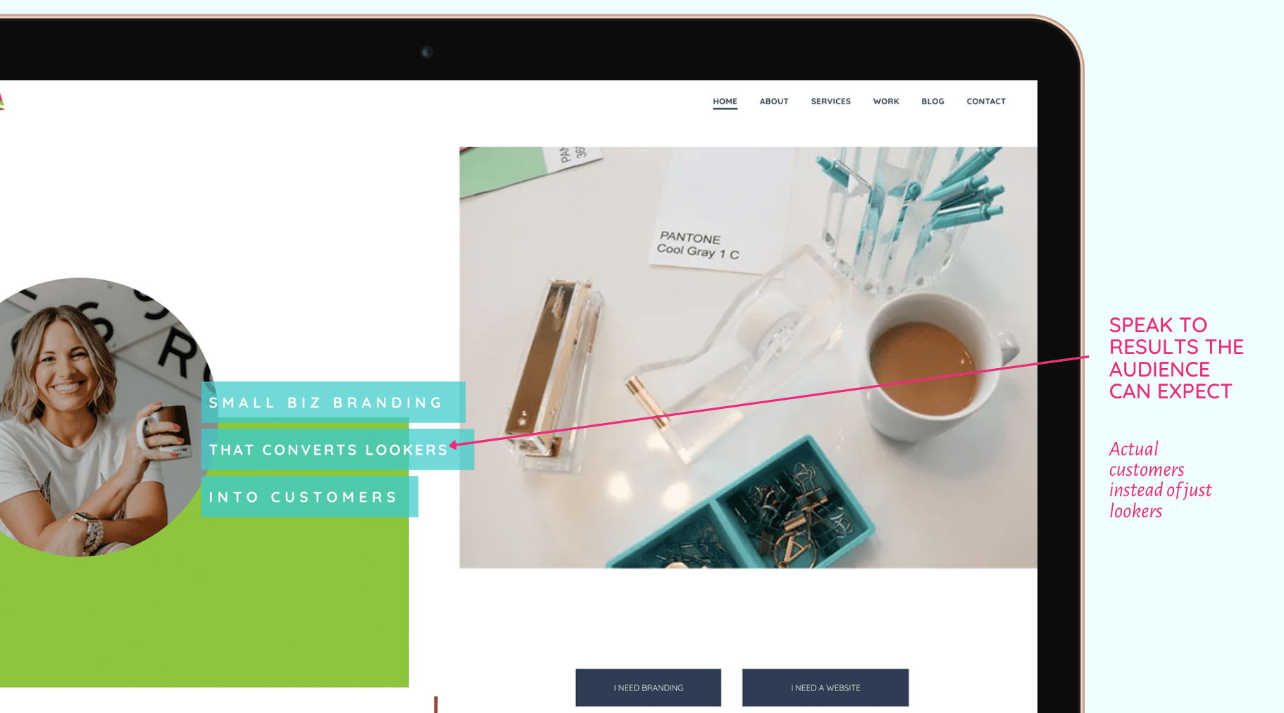
If speed of service is important to your customer you can get specific with how fast they can expect that result or transformation!
3. CLEAR CALL TO ACTION
And last but certainly not least, your CLEAR call to action!
How many times have you visited a website and you’re served with a menu with 6 different tabs, a pop up form and 3 buttons above the fold and you’re left wondering what the heck you’re supposed to do?!
As a designer, those scenarios make me cringe. I can’t stress enough how important a clear call to action is.
The only time I’ll let multiple calls to actions slide above the fold is if you have two clearly defined different options and you want the user to choose what they specifically need.
THAT'S EXACTLY WHAT I DO HERE:
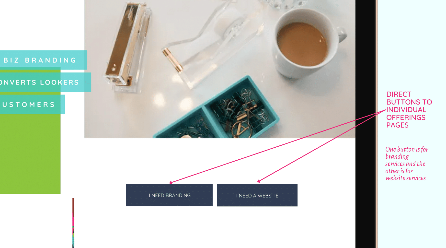
A call to action, often abbreviated as CTA, is simply a button that prompts the user to take ONE next action. When created strategically, it’s the thing that will move someone along in your customer journey.
It’s important to know that there are two different types of call to actions: direct and transitional.
A direct call to action is something that often will lead to a sale. These are usually what you see on a sales page for an online course or on a product page. It’s the “add to cart” type of action.
A transitional CTA, on the other hand, is an action that someone can take without spending money. It’s a low-commitment step that’s created to build the relationship and get them connected with you in some way.
Transitional CTA’s are what you’re probably used to seeing almost every day. These usually come in the form of “learn more,” “subscribe now,” or “follow for more.”
Each page on your website should have some sort of CTA that falls above the fold, even if it just moves someone further on your website!
The key with CTA’s is clarity so the person knows exactly what step they are taking. It’s tempting to make the button words cute and fun, but when it’s not clear, that can cause confusion for the user which can lead to no decision at all.
Here are a few clear call to actions to consider:
- Sign me up!
- Subscribe Now
- Save my spot
- Learn More
- Put me on the list
- Send a message
- Buy Now
- Book My Call
Pro-tip: Opt for CTA buttons that tap into the power of using the voice of the customer, (ex: “I Need Branding” & " I Need a Website") making it irresistibly clickable.
When you intentionally design your above-the-fold sections throughout your website pages, using these three factors, you can increase the chance of people landing on your website, successfully grabbing their attention and moving them into clear action.
Clear action creates more leads, which ultimately creates more sales and as a business owner. I know that’s what you want, isn’t it?!
If so, your ACTION (😏) for the day is to go audit your website pages and make sure that the section that falls above the fold is optimized for both desktop and mobile!
Wanna save this for later?! Pin the image below!! 📌

Your designer friend always,


The A-List is your 60-second inbox scroll for local brand and website tips, savvy small biz resources and the take-aways you need to get through this crazy thing called entrepreneurship.
Join the email community!
Email Community Signup
BLOG TOPICS


BROWSE RECENT POSTS


I get to use creativity everyday to help entrepreneurs focus on their passions to discovering their brand's "sweet spot" in the marketplace...and I absolutely LOVE IT!
I'd love to connect with you to chat more about your business.