You probably already know you need a website for your business, but did you know there’s a right and a wrong way to design your site?
I see this scenario a lot when working with new clients…
They have a gorgeous website that is filled with beautiful fonts and photos, but it’s lacking one thing:
strategy.
And I get it! You want your brand to be pretty and aesthetically pleasing. But I truly believe that no amount of cuteness can convert the amount of people that you truly desire.
Sure, you’ll get some sales that keep you afloat, but when you have a website that goes beyond the aesthetics and is rooted in strategy, THAT is when you get to experience the true magic of website conversions.
TO HELP YOU MOVE FROM A WEBSITE THAT JUST ATTRACTS LOOKERS TO A WEBSITE THAT CONVERTS PEOPLE INTO REAL CUSTOMERS, I'm BREAKING DOWN THE ELEMENTS THAT I CONSIDER TO BE WEBSITE MUST-HAVES.
5 Elements of a Website that Convert Lookers into Customers
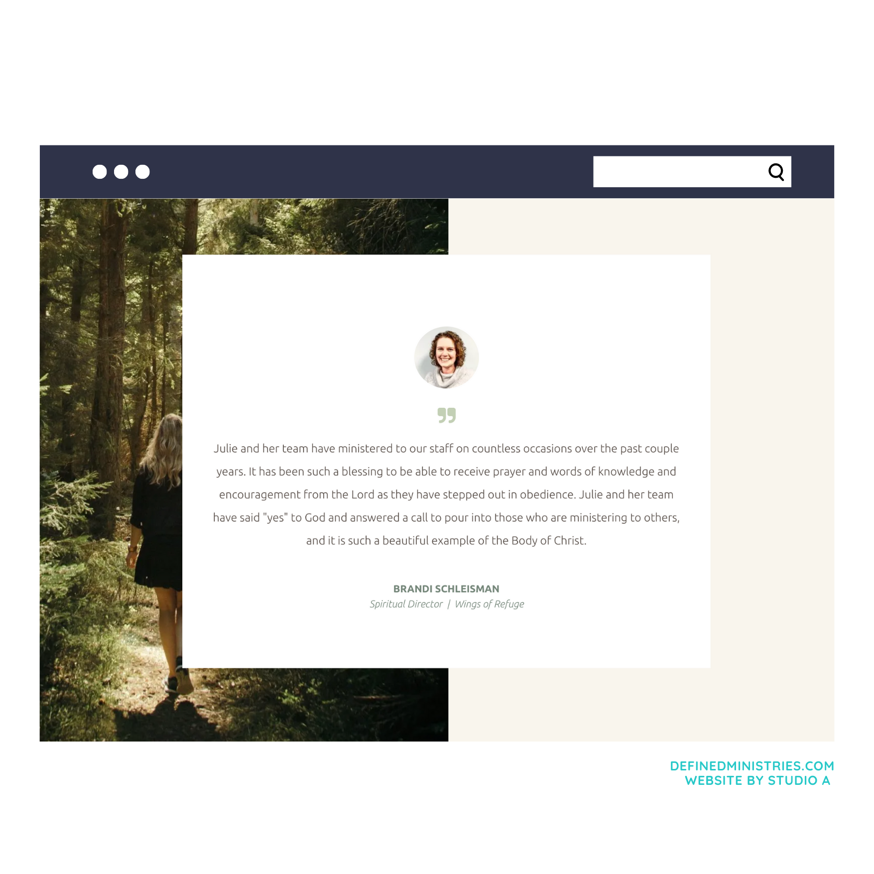
1. Social Proof
Did you know that 95% of people read reviews before making a purchase? And 70% of those people will confidently buy based on a recommendation from someone they don’t know?!
Think about it: if you’re purchasing something on Amazon, you’re probably going to read the reviews first. And if the majority of those reviews are 4+ stars, then you’re likely going to move forward in your purchase.
Well, your products and services are no different. You want social proof, testimonials and case studies to be front and center all throughout your site so that people gain the confidence they need to do business with you.
If you don’t already have a proper system in place to capture reviews from your clients, I encourage you to make that a priority! It can be something as simple as a Google Form that you send to your clients during their offboarding.
2. Highly Visible Calls-to-action
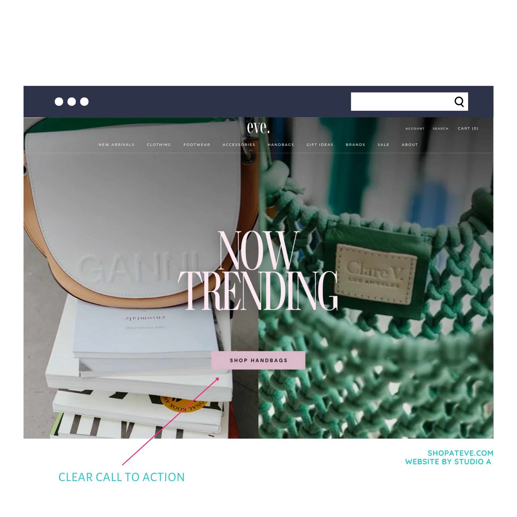
When people visit your website, you don’t want them guessing what to do next. Instead, you want them to be guided!
Your calls-to-action all throughout your website get to be that guide and it moves them through your customer journey very strategically.
For example, when someone lands on your website, your home page should briefly introduce who you are and what you do and immediately guide someone along to learn more.
Most of the time, you’ll have a highly visible button above the fold that will lead someone to the next part of your website that you want them to be on.
This can look different for everyone, depending on your goals, but some common call-to-actions for the home page include:
- Learn more - this typically leads to your about page or services page so that people can learn more about what you specifically do or what you offer
- Subscribe - this is perfect if your goal is to get people onto your email list
- Contact - if you want people to contact you directly, this is a great option
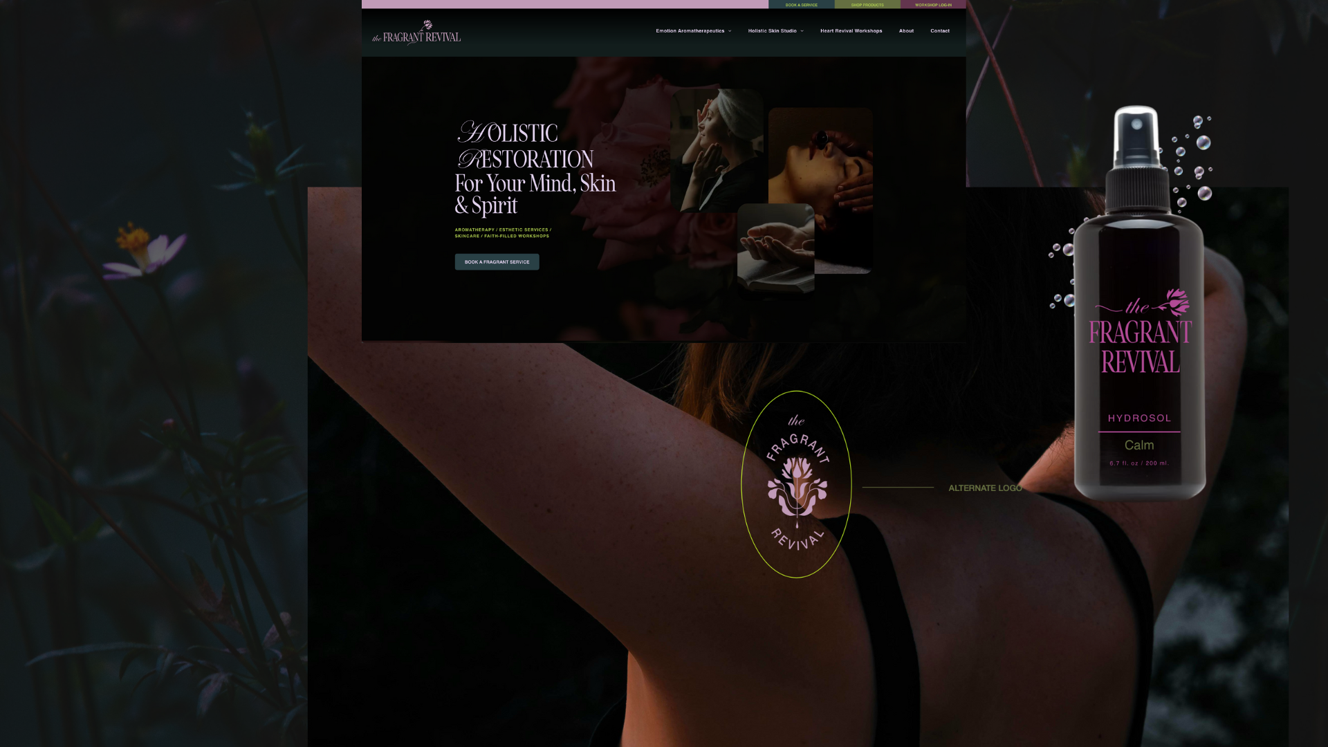
Here’s what my homepage call-to-actions look like:
Because I have two core services that I offer, I want those to be clear! The two buttons allow my audience to choose their own journey based on what they need so they can find the exact information that’s made for them.
When people are left guessing what their next step should be, they’re likely going to exit, which completely defeats the purpose of your website!
In addition to your home page, make sure you’re including buttons like this all throughout so that you minimize the risk of losing people.
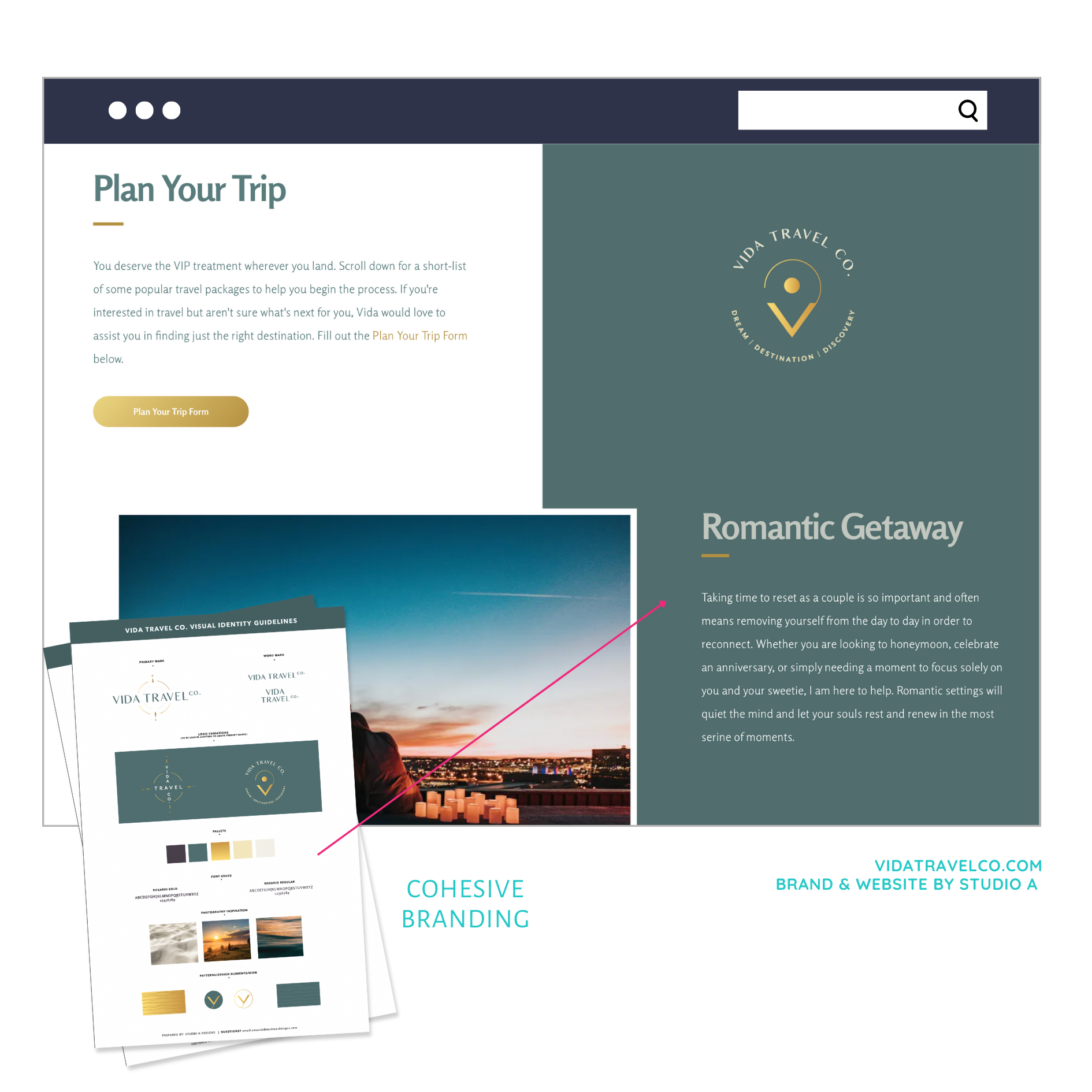
3. Consistent & Cohesive Branding
I know, I know… I just told you that looks aren’t everything. But looks are something.
What I mean by “looks aren’t everything” is that you can’t pretty your way into a website that sells.
A lot of times people think that if they just buy a website template, DIY their brand with nice colors and fonts from Canva and throw some beautiful pictures on the page, then they can call it quits.
But the truth is that your
branding is a part of the overall strategy, which means it needs to be well thought through.
The colors and fonts you choose will evoke certain emotions and feelings for people who land on your website, so you want to make sure that your branding conveys what you want it to convey.
Additionally, your brand should exude your unique personality. People buy from people which means that who you
truly are matters and it should be 100% displayed through your brand!
I often see people trying to shy away from this because they don’t want to compromise professionalism, but when you incorporate your personality into your branding, you build an instant connection with your ideal customer and it leads to faster conversions every single time.
4.
Powerful Copy & Attention Grabbing Headlines
There’s two main things that make up the perfect website: the copy and the design. You can’t have one without the other and when done correctly and strategically, the two work together perfectly!
The copy on your website is essentially all of the words that you use to convey who you are, what you do and who you serve. It’s your overarching message that will captivate your ideal audience and turn away those that aren’t a good fit.
When you’re creating your website, the copy comes first and that’s because the words will really guide your design.
When you work with a professional copywriter, you’ll notice that none of the words they write are written by mistake. They’re all part of a process that’s designed to again, GUIDE your reader through your website in a strategic way!
It’s rare that someone is going to read your website word for word, which means the copy needs to be written AND designed to grab the attention of your website lookers and this is usually done through intentional formatting and proper headlines.
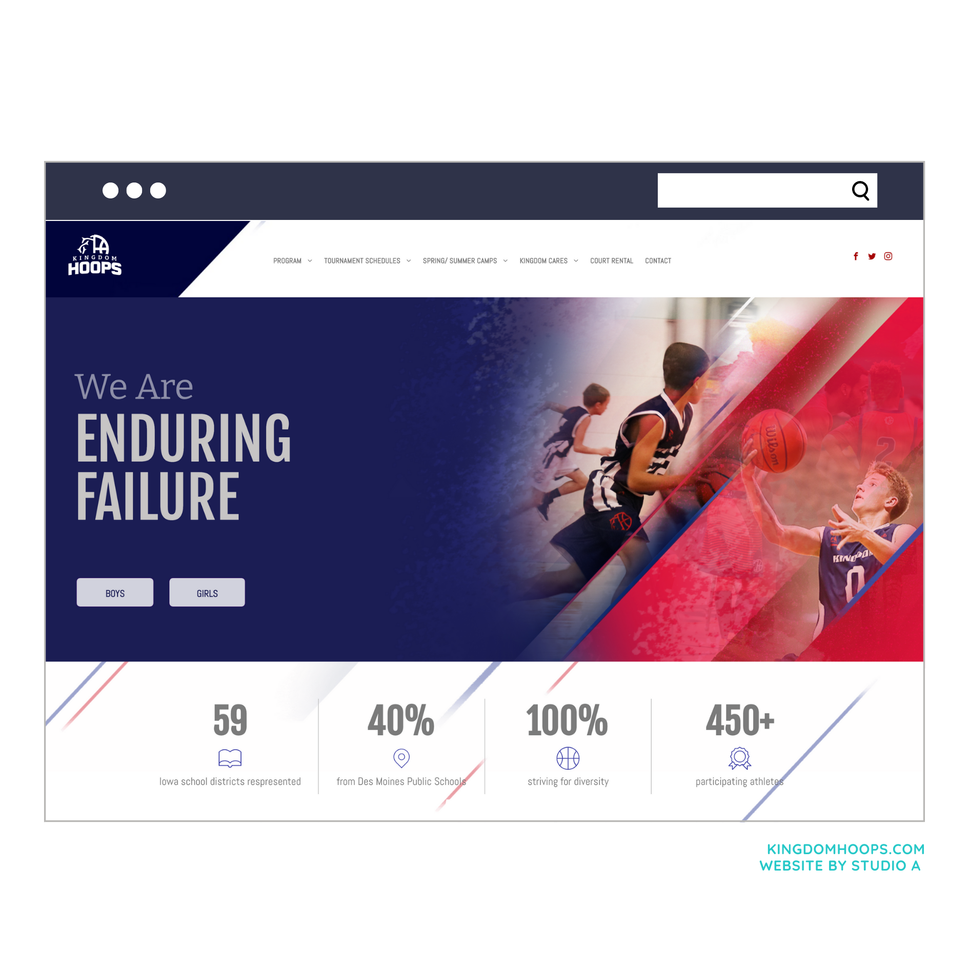
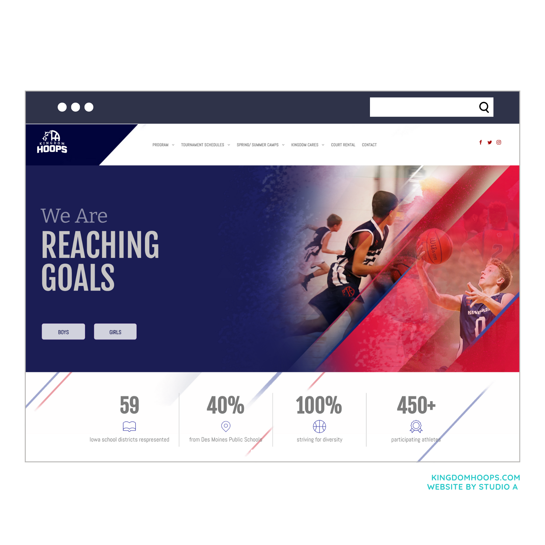
To help you see what this looks like in action, here are two website homepage examples - which one stands out to you the most?
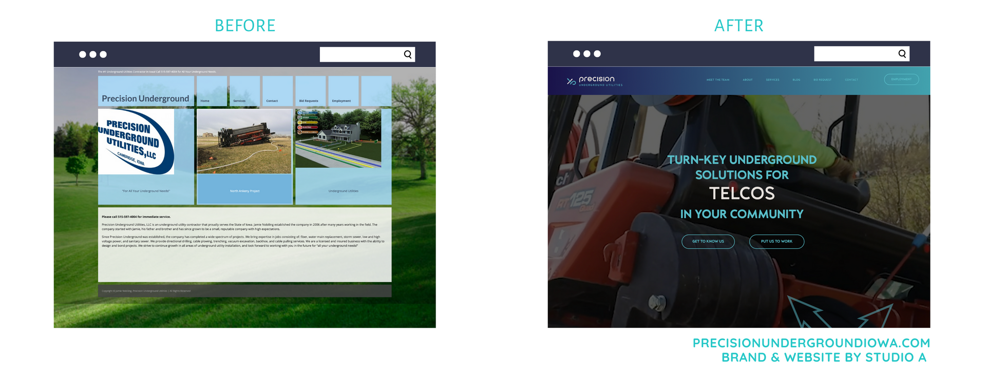
The one with a large, bolded headline is the clear winner!
When you can effectively capture your audience’s attention right away through your copy, you stand a better chance of them continuing to navigate your site and possibly even capturing them as a
real lead.
5. Problem Solving Content
Lastly, one of the most important elements of your website that can convert lookers into customers is the amount of problem solving content that you have available for your readers.
This might be an unpopular opinion, but your website isn’t just a place for you to display how amazing you are and get people to buy from you.
I know, it’s a bit counterintuitive since this blog is about converting people into customers, but hear me out…
Your website should be viewed as a RESOURCE for your people meaning it should be packed full of content that really helps solve their problems.
That’s not to say you shouldn’t talk about your offers on your website - you
absolutely should do that. But the key is that you do it in a way that really speaks to what your ideal customer is feeling when they land on your website.
What are their frustrations? Call those out and guide them to a solution.
What’s something they’re currently believing that’s causing a lack of results? Speak to that and help shift their perspective.
Where are they currently at and where do they want to be? Help them see what’s possible.
This is all done through your messaging and it should show up across every single page on your website!
Additionally, you can go deeper into their pain points and help them solve problems with tangible takeaways by guiding them to your blog or email list where you create content around specific topics that relate to your industry - kind of like what you’re reading here!
Overall, your website has huge potential to convert people into customers very quickly when it’s created correctly.
I know it’s tempting to fall for the pretty website templates, but before you do that, I encourage you to think about the real purpose of your website -
is it there just to impress people? Or is it there to truly serve them?
If your ready to go beyond aesthetics, but need help getting there, I'm your gal. 👋🏼
CONNECT here to see how you can have a website that increases new leads, grows your brand awareness and helps you stand out from your competition!
Cheers !! 🥂

The A-List is your 60-second inbox scroll for local brand and website tips, savvy small biz resources and the take-aways you need to get through this crazy thing called entrepreneurship.
Join the email community!
Email Community Signup
BLOG TOPICS
BROWSE RECENT POSTS
I get to use creativity everyday to help entrepreneurs focus on their passions to discovering their brand's "sweet spot" in the marketplace...and I absolutely LOVE IT!
I'd love to connect with you to chat more about your business.


