I’m not big on hot take marketing, but I must admit I have a hot take of my own that I think it’s time I share… 🔥
There are some really boring brands out there. And there are also a LOT of brands that look the same.
This doesn’t necessarily mean the brand isn't successful or that they don’t generate results, but from the outside looking in, this is simply what I see.
And if you were to scroll your Instagram feed, you’d probably start to see what I mean and agree…
And honestly, I get it.
In a world filled with trends, it’s easy to morph into what you think people are attracted to.
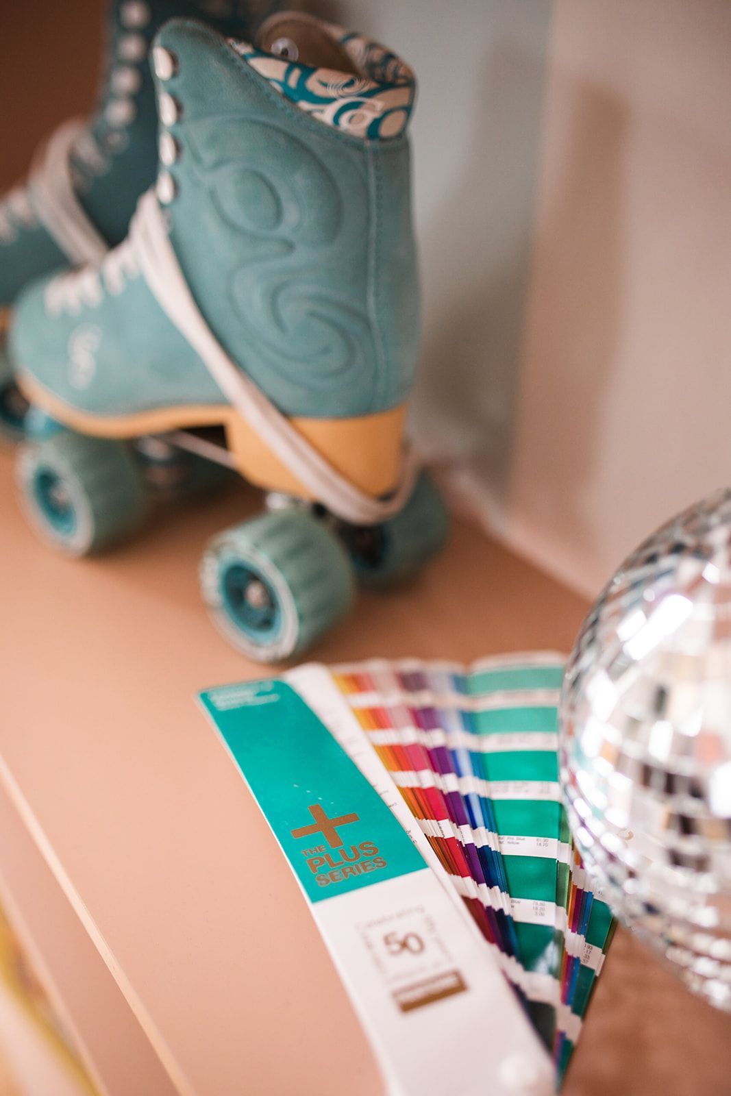
If Pantone claims the color of the year is Magenta, you might think you need to start using more magenta in your brand.
It’s like when TikTok told the girlies back in January that fur coats are back in… what did everyone do? Stock up on their fur coats they swore they’d never buy again. 🤦🏼♀️
See what I mean?
Because of the trendy world we’re so easily influenced by, it can be hard to create a stand-out brand that’s unique and meaningful to YOU.
You might be inspired by design from one brand and then influenced by color from another and it makes it nearly impossible to create something that accurately represents you in the market.
This is where working with a professional brand designer can come in handy.
They can help you ditch the trends of what everyone else is doing and hone in on specific brand aspects that make sense for you, depict who you really are, and help you effectively stand out in your industry, just from your brand design alone.
So, let’s get into what brand design really even is and then dive into the psychology behind bold and colorful brands, along with a few companies who I personally believe do this really well!
What Is Brand Design?
First things first, I want to be clear on what I even mean when I say brand design, because I’ll admit, that can feel like a jargon filled word if you’re not in the branding or marketing world.
Put simply, brand design is a strategic and creative process of crafting a visual identity that represents your brand's values, personality, and unique attributes.
And no, it’s not JUST your logo! Yes, your logo is included in your brand design, but it also involves other visual elements that collectively communicate your brand's essence to your target audience.
Essentially, brand design aims to create a consistent and memorable visual language that distinguishes your brand in the market.
Key components of a brand design often include:
- Logo design
- Color palette
- Typography
- Imagery and Graphics
- Packaging design (for product based businesses)
- Brand collateral (such as business cards or other printed or digital materials)
- Website design (although website design is often a separate project from brand design, it’s still important that the two are seamlessly connected)
There’s so much that could be said about each of these elements of a brand design, but for this blog post specifically, I want to hone in on color. 🎨
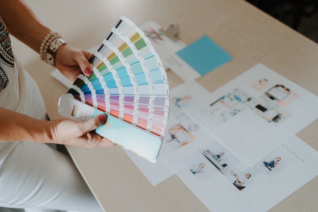
Colors for your brand shouldn’t be chosen at random and it’s important to fully understand what each color means before you use it as a part of your brand.
And yes, colors have meaning. In fact, there’s an entire psychology behind them. ⬇️
An Overview Of Color Psychology and How Certain Colors Impact Your Brand
Let me preface this by saying: by no means am I claiming you can’t have white, black, beige, or brown infused throughout your brand if it makes sense.
But I would much rather you do so if it’s done with reason and strategy – not just because that’s what someone else in your industry is doing and you think you should, too.
The best brand colors are chosen with a clear purpose in mind, so let’s dive into the color psychology of some of the most popular colors you’re probably used to seeing.
If you’re unfamiliar, color psychology suggests that different colors can evoke specific emotions, moods, and associations. While it’s true that individual perceptions may vary, there is a general rule of thumb associated with every color on the color wheel.
For the sake of this blog post, let’s review the 10 most popular colors:
- Blue
- Meaning: Trust, calmness, stability, and professionalism.
- Associations: Often used by corporate brands to convey reliability and by healthcare brands for a sense of calm.
- Red:
- Meaning: Passion, energy, excitement, and urgency.
- Associations: Used by brands to grab attention and create a sense of urgency, often seen in sales and clearance promotions.
- Green:
- Meaning: Nature, growth, health, and eco-friendliness.
- Associations: Commonly used by environmentally conscious brands, health-related products, and companies promoting sustainability.
- Yellow:
- Meaning: Happiness, optimism, energy, and warmth.
- Associations: Frequently used in brands related to food, entertainment, and to convey a positive and lively image.
- Purple:
- Meaning: Luxury, sophistication, creativity, and royalty.
- Associations: Often chosen by high-end brands to convey a sense of exclusivity and elegance.
- Orange:
- Meaning: Vibrancy, enthusiasm, and energy.
- Associations: Used by brands to create a lively and friendly image, common in the food and beverage industry.
- Pink:
- Meaning: Romance, sweetness, and playfulness.
- Associations: Commonly used in products targeting a female audience or to convey a sense of warmth and compassion.
- Black:
- Meaning: Elegance, sophistication, and power.
- Associations: Often used by luxury brands to convey a sense of exclusivity and by tech companies to project a sleek and modern image.
- White:
- Meaning: Purity, cleanliness, and simplicity.
- Associations: Commonly used in healthcare, technology, and lifestyle brands to convey a clean and minimalist image.
- Gray:
- Meaning: Neutrality, balance, and sophistication.
- Associations: Frequently used in corporate branding to convey a sense of professionalism and stability.
It's important to note that color meanings can also be heavily influenced by cultural and personal factors.
Either way, the context in which certain colors are used plays a significant role in how your audience will perceive your brand as a whole!
This is why when creating your brand design, understanding color psychology can help in making intentional choices that resonate with the desired emotions and messages you want your audience to perceive.
Examples of Bold and Colorful Brands That Are Doing It Right
Once you understand color psychology and are ready to choose which colors you incorporate into your brand, it’s not as simple as saying,
“I’m going to use red as my primary color,” like Coca-Cola has done or choosing to make pink your thing, like T-Mobile.
Sure, these are examples of how brands have chosen a color to be known for and while that can be effective, when I do my work as a brand designer, I prefer to take it further with a sophisticated, modern, and well-designed identity system that is 100% backed with reason and strategy.
Again, your colors shouldn’t be chosen at random or just because they’re trendy. Forget about the proposed color of the year and choose colors that truly align with what you want to convey.
Ultimately, your brand should be able to grow with you and establish you as a unique spot in the marketplace.
Billie Razor 🪒
Billie Razor is known for its disruptive and inclusive approach to women's shaving products. The brand gained attention not only for its high-quality razors, but also for challenging traditional beauty standards and promoting body positivity.
As a whole, the brand takes a minimalist approach and promotes a clean aesthetic, which is 100% conveyed through their color choice as well.

Through a combo of bold and pastel colors, the brand effectively conveys the emotions and associations that they want their audience to perceive, including femininity with the hot pink, cleanliness with the light blue, and a sense of sophistication with the bold red.
Bubble Skincare 🧴
Bubble Skincare is disrupting the skincare industry with their new-school approach to skincare in an old-school skincare world.
And this “new-school” approach is SO evident in their branding!

When Bubble first launched, their CEO even said, “the goal was to create a skincare brand with an affordable price point while forging an emotional attachment among young consumers” and they’re doing just that through the colors they choose for their products and their overall fun branding.
Poppi 🥤
What once began as “Mother Beverage” in 2018, is now the well known company that has set out to take over the soda industry – and I personally think they’re doing a great job of it!
Beyond their pop art inspired designs alongside their bright color palette and fruit inspired graphics, Poppi is the perfect example of a rebrand gone RIGHT.

The original focus on the company highlighted apple cider vinegar as the main component of the drink and honestly, the branding looked dated and uninviting.
Now, instead of highlighting apple cider vinegar as the main component, they list fun flavors on their cans to lead with a prebiotic soda drink instead.
Because let’s be real… who really wants to drink apple cider vinegar? No one. But people DO want to drink a healthier version of Classic Cola, Root Beer, and Dr. Pepper.
Insert Poppi’s version!
Be honest: which of these would you be more apt to grab at the grocery store? I know which one I’d pick. Poppi uses bold colors to boost the appeal, especially among younger generations!
Sugarfina 🍬
Sugarfina is a luxury candy boutique known for its upscale and stylish approach to confectionery.
As a whole, Sugarfina is recognized for its elegant and sophisticated packaging that displays pastel colors, gold accents, and high-quality materials to create a luxurious and gift-worthy appearance.
The way they’ve designed their branding conveys their upscale approach and positions them in the market as not your average convenience store candy.
The colors they’ve chosen to use in their logo and throughout their product packaging convey a sense of sweetness and elegance, which both align with the brand’s high quality identity in the candy market.

Overall, Sugarfina's branding is designed to attract a premium and sophisticated consumer segment and they set out to achieve this through the emphasis on quality ingredients, stylish packaging, and unique flavor combinations which all positions them in the luxury confectionery market.
ABC Cans ♻️
Lastly, a personal favorite, and yes… I may be biased as this is a client project that I was so honored to work on!
When owners of Ames Bottle and Can, JL and Evan, contacted me about the upcoming opening of their local redemption center, it was apparent that both owners were savvy business people. I immediately knew we were a good fit when they talked about their love for giving back to the community and how much they believed in the importance of branding for small businesses.
During our brand strategy, we discovered they were up for having a bit of fun conveying their brand and messaging.
When you typically think of can and bottle redemption, you probably think of the gross, sticky, smelly can machines you have to feed, one by one. Most people don’t like this experience and probably don’t view it as very fun.
But Ames Bottle and Can? They are on a mission to make recycling feel FUN, so it’s important that their branding conveys that very thing!
That’s why when working with this business, I opted for bold colors and fonts paired with aesthetic and fun feeling icons so that the company could lead with their fun messaging and have a brand identity that went along with it.
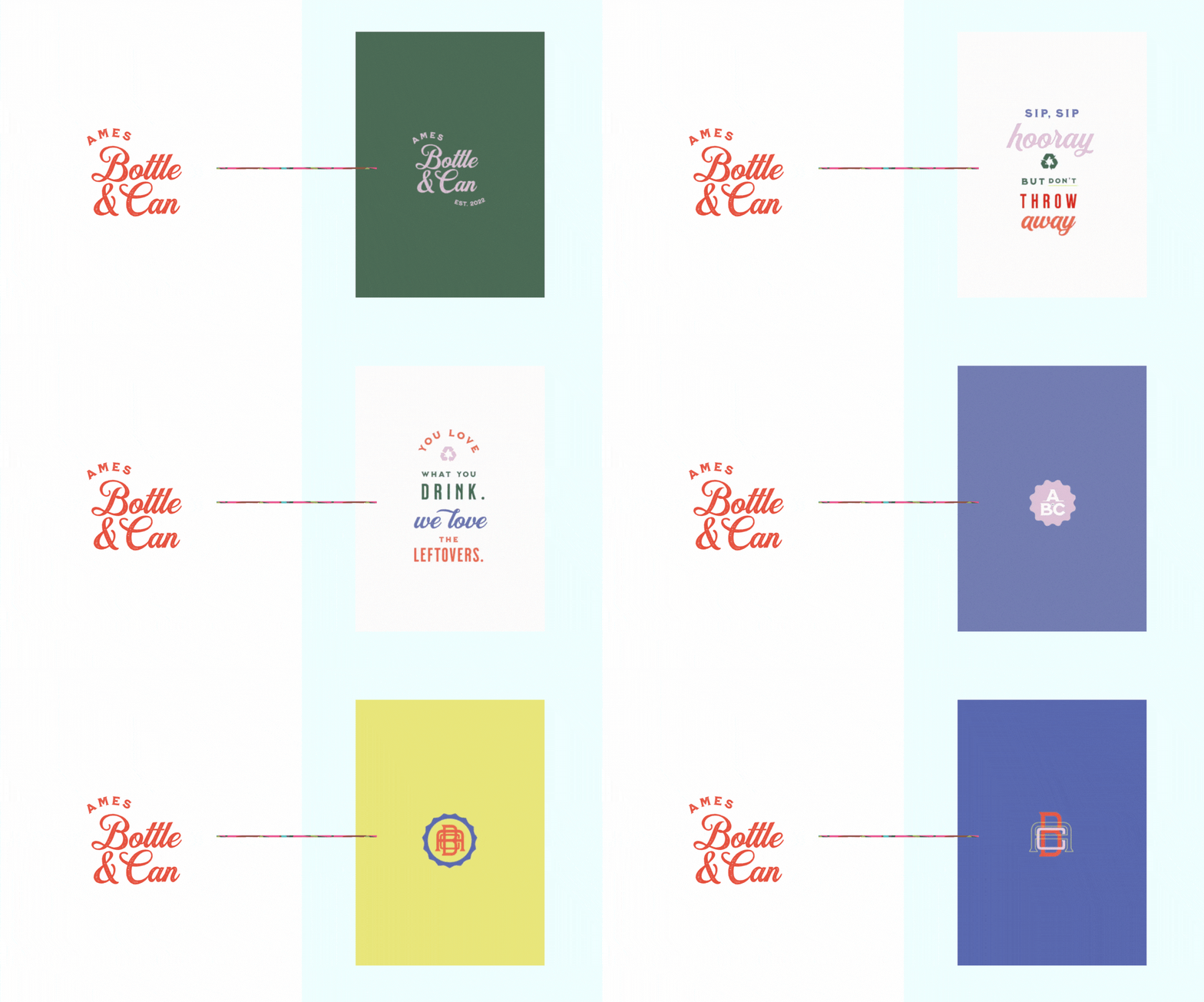
The moment you navigate to their website, I can almost guarantee that you’ll feel different about recycling right away.
That my friend truly the power of branding, but color specifically!
A Short Exercise To Determine What Your Brand Conveys To Your Audience
Overall, your branding should not be something you choose by random. All parts of your brand identity – including your logo, colors, fonts, and icons – should be designed with strategy in mind.
It’s so important to consider how you want your audience to feel and what message you want to convey to them.
As crazy as it might sound, color alone can be the thing that makes or breaks your brand positioning in the market.
So, with all of these things in mind, I invite you to observe your brand as if you were looking at it as a potential customer or client for the first time. Ask yourself:
➡️ Does my brand convey what I want it to convey?
➡️ How do the colors in my branding make me feel?
➡️ Does my logo and other brand identifiers (such as icons, etc.) align with my brand messaging?
Your answers to those questions can really help you determine how your brand comes across in the marketplace and if you don’t like what you’re seeing… don’t worry!
A few simple changes can go a long way.
Maybe it’s time for a full rebrand. Or maybe a small brand refresh is what you need.
Either way, I’m here to help you navigate the wonderful world of branding so you can feel confident when you show up online!
CLICK HERE to learn more about my brand design services and to see if we’re a good fit.
Your designer friend always,

The A-List is your 60-second inbox scroll for local brand and website tips, savvy small biz resources and the take-aways you need to get through this crazy thing called entrepreneurship.
Join the email community!
Email Community Signup
BLOG TOPICS
BROWSE RECENT POSTS
I get to use creativity everyday to help entrepreneurs focus on their passions to discovering their brand's "sweet spot" in the marketplace...and I absolutely LOVE IT!
I'd love to connect with you to chat more about your business.
