Imagine you've just launched your dream business and you're pumped to start creating killer content. You find a template in Canva that's totally your vibe, but the fonts? Not so much. So, you keep scrolling, searching for the perfect match.
But here's the thing: every time you find a new template, you're faced with a whole new set of fonts.
It's like trying to decide between your favorite pair of jeans and a new trend that's totally not you.
You may be all for certain trends, but perhaps the horseshoe denim trend is too far out of your comfort zone! 😬😬😬 #iykyk
Let's ditch the font fatigue and create visuals with free Canva font pairings consistent with your favorite pair of (classic) jeans.
Trust me, font flip-flopping can be a major branding blunder. Inconsistent fonts can make your visuals look chaotic and confuse your audience.
I’m not exaggerating when I say there are thousands of fonts out there. But I’m here to help simplify your search so you can get back to your small business zone of genius faster.
6 Chic Canva Font Combos for Stunning Designs
You’ll want to read to the end of this post because first I’m showing you how to choose complementary font pairings so you can save time and guesswork out of your endless font scrolling.
Keep scrolling because I’m also sharing some of my favorite pairing examples and how to apply them to your designs.
The Benefits of Assigning Fonts to Your Visual Brand
In the world of branding, consistency is key. A strong brand identity is built on a foundation of recognizable elements, including your logo, colors, and, of course, fonts. Consistent font usage plays a crucial role in reinforcing your brand's personality and making a lasting impression on your audience.
Brand Recognition: When customers see your brand's fonts, they should immediately recognize this component. Consistent font usage helps to create a strong association between your brand and its visual identity.
Visual Appeal: A cohesive visual aesthetic is essential for a professional and memorable brand. Consistent fonts contribute to a harmonious and visually appealing look that reflects your brand's personality.
Professionalism: Consistent font usage conveys a sense of professionalism and credibility. It shows that you've put thought and care into your visuals and are committed to maintaining a high standard.
Tips for Choosing the Best Font Pairings
You might feel like a font is a small design detail, but I’m here to tell you it is WAY more important than you might think.
I share more detail about the importance of good typography and understanding common terms in my blog post here —>
Small Biz Guide to Graphic Design: Typography Edition. Let’s dig into my top tips for choosing the best font pairings.
Contrast is Key:
- Serif vs. Sans-Serif: Combine a serif font (with small strokes at the ends of letters) for headings or titles with a sans-serif font (without these strokes) for body text, or vice versa. This creates a visual contrast that is both pleasing to the eye and easy to read.
- Weight and Size: Varying the weight (boldness) and size of your fonts can also create a visually interesting and harmonious look. For example, you could use a bold heading font with a smaller, regular body font.
Complementary Styles:
- Similar but Different: Choose fonts that have similar characteristics but differ in subtle ways. For example, a serif font and a slab serif font (with thicker, slab-like serifs) can complement each other.
- Complementary Moods:
Consider the mood or emotion you want to convey. For example, a playful script font paired with a modern sans-serif font can create a fun and energetic vibe.
Avoid Overwhelm:
- Limit Font Choices: Stick to two or three fonts maximum to avoid a cluttered and confusing design.
- Consistent Hierarchy:
Use different font sizes and weights to create a clear
hierarchywithin your design. This will guide the viewer's eye and make your content easier to read.
Consider Readability:
- Legibility: This is a big one! Make sure your chosen fonts are easy to read, especially at smaller sizes. Avoid fonts that are too ornate or difficult to decipher.
- Spacing: Pay attention to
line spacing and letter spacing to ensure that your text is easy to read and doesn't appear cramped or crowded.
Pro Graphic Design Tips for Using Free Canva Fonts
Maintain a Consistent Hierarchy:
Use different font weights and sizes to create a clear hierarchy within your designs. This will help guide the viewer's eye and ensure your message is delivered effectively.
Test and Iterate: Experiment with different font pairings to find combinations that work well with your brand. Don't be afraid to test and iterate different designs until you find the perfect match to put out in the world.
Consider the overall aesthetic of your brand: When selecting font pairings, ensure that they complement the overall aesthetic of your brand. For example, if your brand is modern and minimalist, you might choose clean, sans-serif fonts. If your brand is classic and elegant, serif fonts might be more appropriate. Consider the colors, imagery, and overall tone of your brand when making your font selections.
Suggested Font Pairings for a Clean and Sophisticated Brand
Let’s say you are a modern and minimalistic brand that’s looking for a sophisticated pair of fonts to use. Here are some examples I’d suggest.
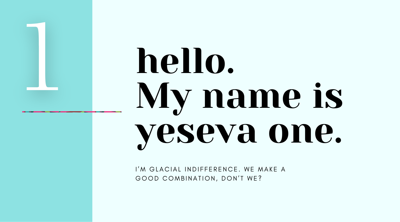
1. Yeseva One + Glacial Indifference
Yeseva One is a bold, slightly serif font with a playful and energetic feel. Glacial Indifference is a clean, sans-serif font with a modern and minimalist aesthetic.
〰️Why they work together: The contrast between the bold, playful Yeseva One and the clean, minimalist Glacial Indifference creates a visually exciting and dynamic pairing.
〰️Suggested uses: Yeseva One is perfect when used as a display or heading typeface, while Glacial Indifference, especially when in all caps, is ideal for subheading text. In addition, Glacial Indifference can be used without all caps with tighter letter spacing for paragraph text.
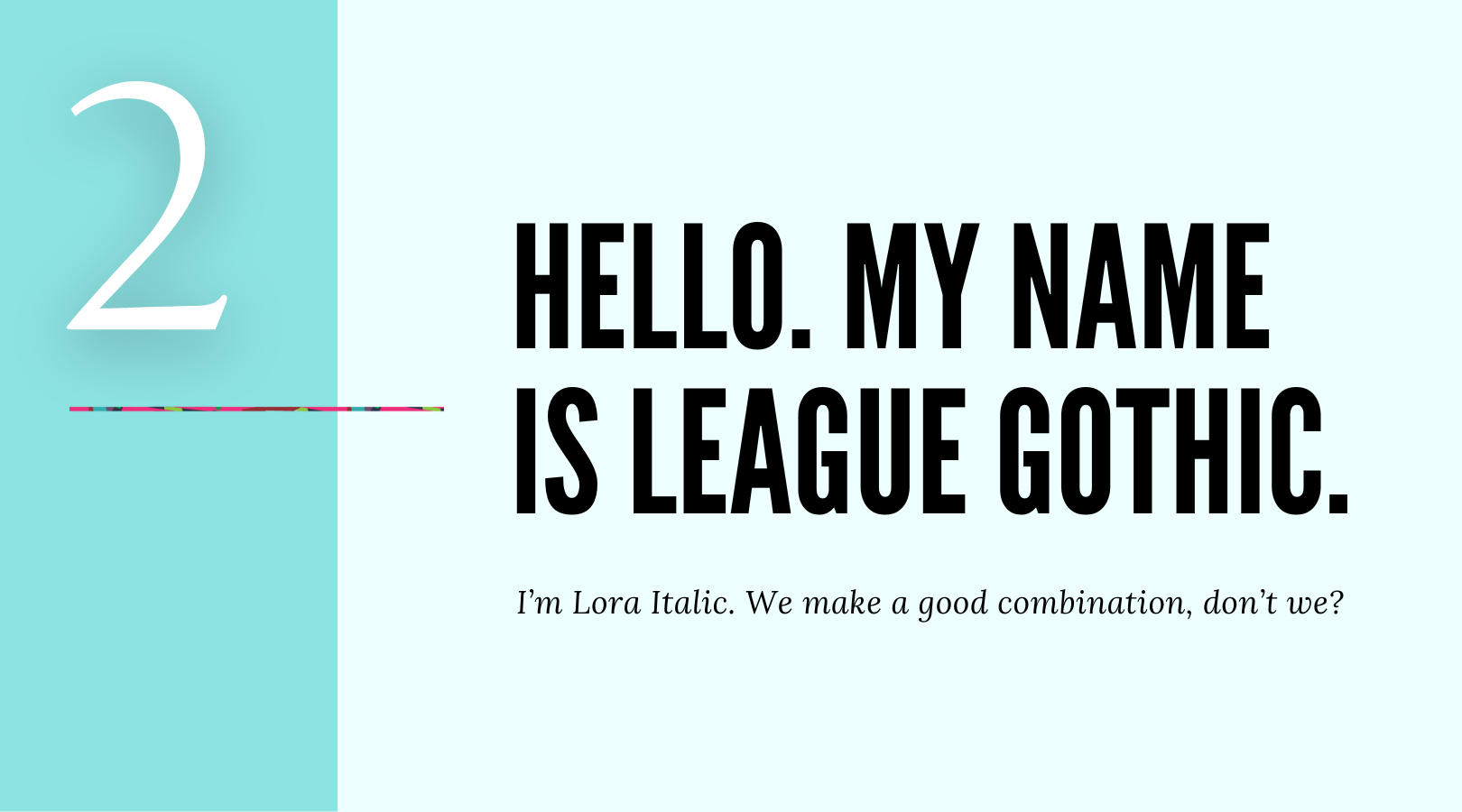
2. League Gothic + Lora Italic
League Gothic is a bold, condensed sans-serif typeface. Lora Italic is an elegant serif typeface that exudes a sense of sophistication and warmth.
〰️Why they work together: The combination of the bold, geometric League Gothic with the classic, elegant Lora Italic creates a sophisticated and timeless pairing.
〰️Suggested uses: League Gothic can be used as a display or heading typeface, while Lora Italic is ideal for subheadings and callout text. Lora Regular could be a pro option for paragraph text.
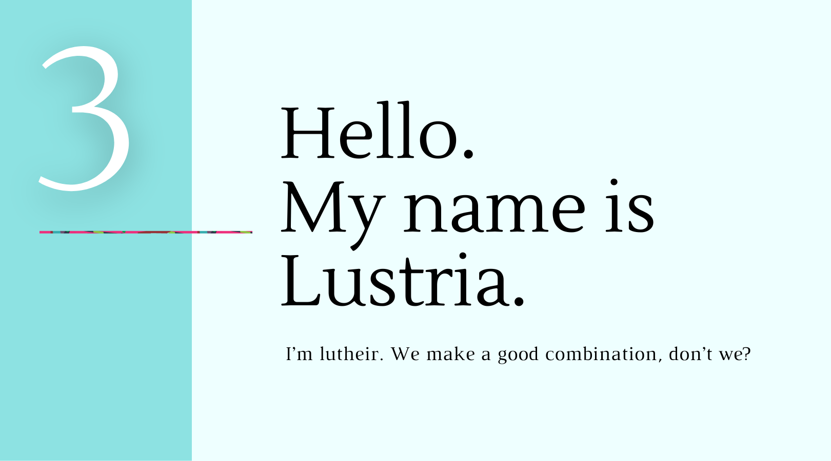
3. Austria + Luthier
Lustria is a script font with a flowing and elegant style. Luthier is also a serif font with a modern and minimalist aesthetic.
〰️Why they work together: The contrast between the flowing, elegant Lustria and the clean, minimalist Luthier creates a visually interesting pairing.
〰 Suggested uses: Lustria can be used as a display or heading typeface while Luthier is ideal for subheadings and/or body text.
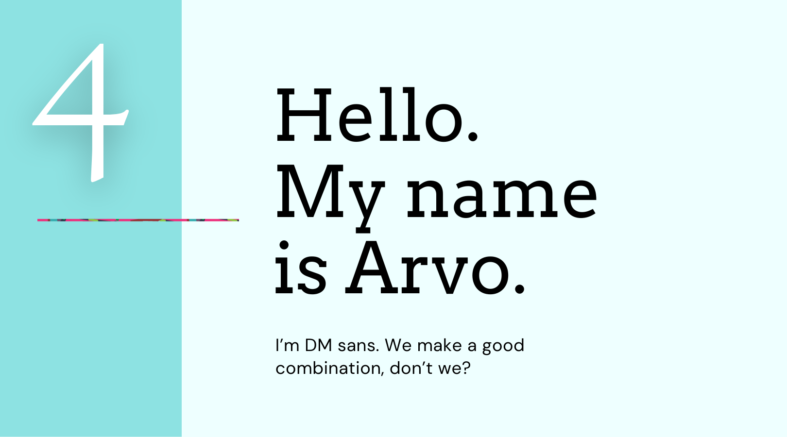
4. Arvo + DM Sans
Arvo is a serif font with a clean and modern aesthetic. DM Sans is a sans-serif font with a geometric and minimalist style.
〰️Why they work together: The combination of the clean, modern Arvo with the geometric, minimalist DM Sans creates a sophisticated and contemporary pairing.
〰️Suggested uses: Arvo can be used for headings and subheadings, while DM Sans is ideal for subheadings or body text.
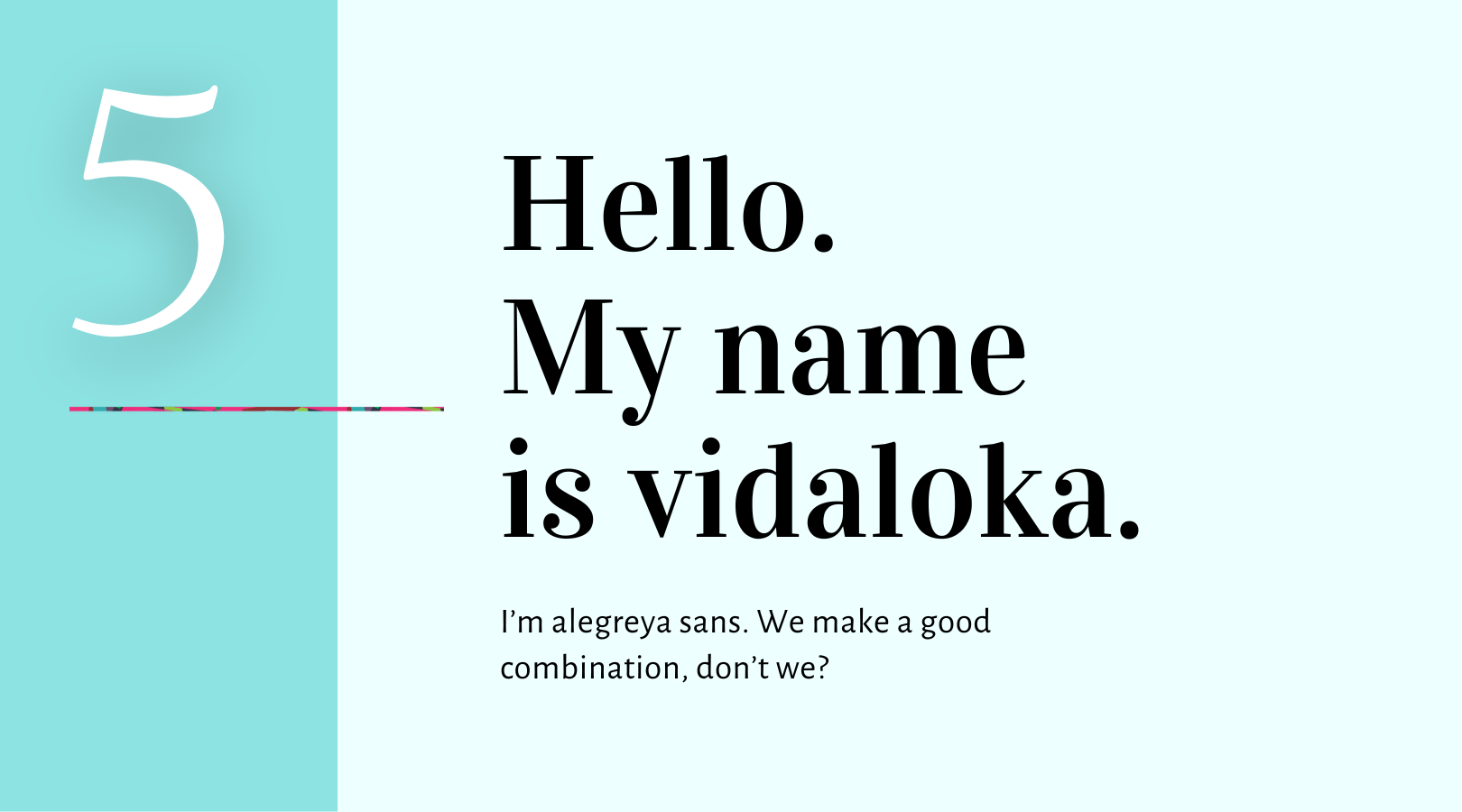
5. Vidaloka + DM Sans
Vidaloka is a serif font with a classic and elegant style. Alegreya Sans is a sans-serif font with a modern and minimalist aesthetic.
〰️Why they work together: Combining the classic, elegant Vidaloka with the modern, minimalist DM Sans creates a sophisticated and timeless pairing.
〰️Suggested uses: Vidaloka can be used for headings and subheadings, while Alegreya Sans is ideal for subheadings or body text.
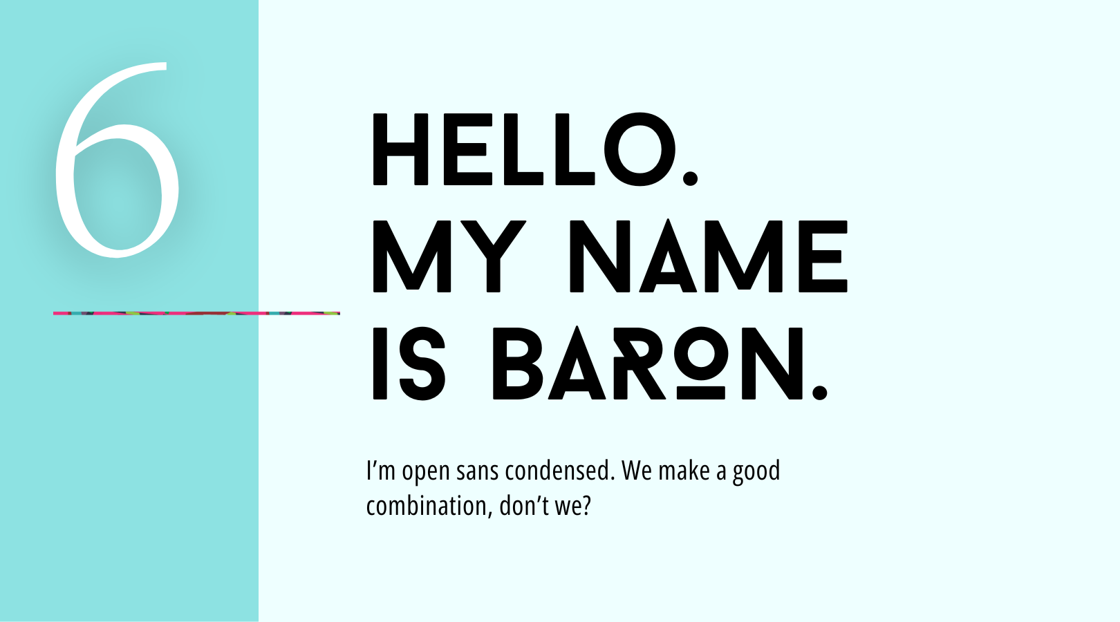
6. Baron + Open Sans Condensed
Baron is a serif font with a bold and impactful look. Open Sans Condensed is a sans-serif font with a clean and modern aesthetic.
〰️Why they work together: The combination of the bold, impactful Baron with the clean, modern Open Sans Condensed creates a strong and visually striking pairing.
〰️Suggested uses: Baron can be used for heading typeface while Open Sans Condensed is ideal for subheadings. Consider Open Sans Regular (non-condensed) for your body text.
Now, it's time to get creative!
Experiment with different font pairings and see what vibes with your brand. Canva has a ton of free fonts to choose from, so have fun exploring.
Want to dive deeper into the world of typography and consistent visuals? Check out these awesome resources:
〰️Free Mini Style Guide: Use this awesome reference tool I created for you so you can keep your brand fonts and other assets consistent across platforms.
〰️FontPair: This site has resource that takes the guesswork out of pairing Google Fonts together with visual pairings laid out for you.
Go forth and create amazing visuals! Your brand will thank you.
_________________________________
At Studio A Designs, I believe in challenging big corporations with powerful local branding. Your brand and website should attract and retain customers who prefer Main Street & local Iowa businesses over big box giants.
Ready to turn customers into loyal fans who say, "I love local, I love you, and I'll definitely be back"?
Contact me today, and let's talk about how brand transformation for your business can strengthen your Iowa community!
Your designer friend always,

The A-List is your 60-second inbox scroll for local brand and website tips, savvy small biz resources and the take-aways you need to get through this crazy thing called entrepreneurship.
Join the email community!
Email Community Signup
BLOG TOPICS
BROWSE RECENT POSTS
I get to use creativity everyday to help entrepreneurs focus on their passions to discovering their brand's "sweet spot" in the marketplace...and I absolutely LOVE IT!
I'd love to connect with you to chat more about your business.
